Washington State Department of Transportation

WSDOT Ferries, iOS · March 2025 · HCDE 517 at UW

The 26 moments where 2 million commutes fall apart every month.

We ran a moderated iOS usability study on the WSDOT Ferries app with 10 Washington residents across 9 task scenarios, from a quick capacity check through to buying a ticket. It surfaced where the app's mental model breaks against the one riders bring with them.

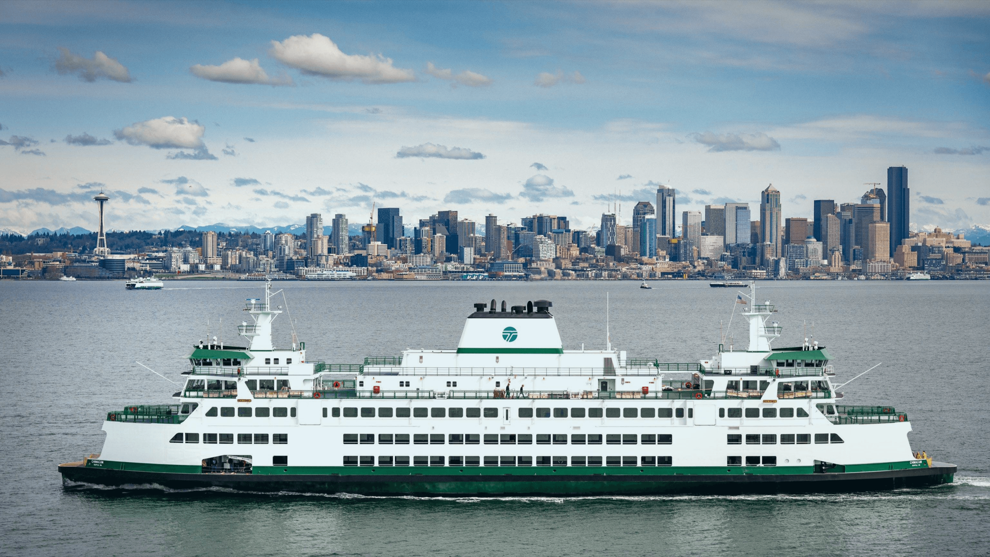
The WSDOT Ferries app on an iPhone

Role & Team

Moderator · Notes · Affinity synthesis

4 HCDE 517 researchers. 10 sessions, 9 tasks, iOS.

Design question

How might we surface the right information at the right moment,

so riders never need to leave the WSDOT app?

Key insight

Riders weren't failing because features were missing.

They were failing because the app spoke the system's language, not theirs.

Outcome

First

Moderated usability study ever run on the WSDOT Ferries app

26

Friction points documented, clustered into five patterns

2 of 9

Task scenarios failed outright. Both were the highest-stakes ones: buying a ticket, and finding an inter-island route.

5

Prioritised recommendations delivered with the report

Context

For some riders, this app is the road home.

The WSDOT iOS app serves Washington State ferry riders navigating Puget Sound. We evaluated the Ferries section: Route Schedules, Vessel Watch, Buy Tickets and Reservations. The question was where friction lives between the app's structure and the decisions riders are actually trying to make.

Riders aren't a uniform group. Some are daily commuters; some visit once a year. For island residents, there is no alternative.

Live on Orcas so ferry is our primary travel to the mainland.

Participant, interest form

What we evaluated

  • Ferries section
  • iOS app
  • Mobile usability
  • Online moderated

Method

Five steps from exploration to intervention.

We didn't start by testing screens. We started by mapping every path the app makes possible, then designed tasks that put the most consequential ones under real use.

Artefacts open where they can. Some are closed to protect participant privacy.

01

Map

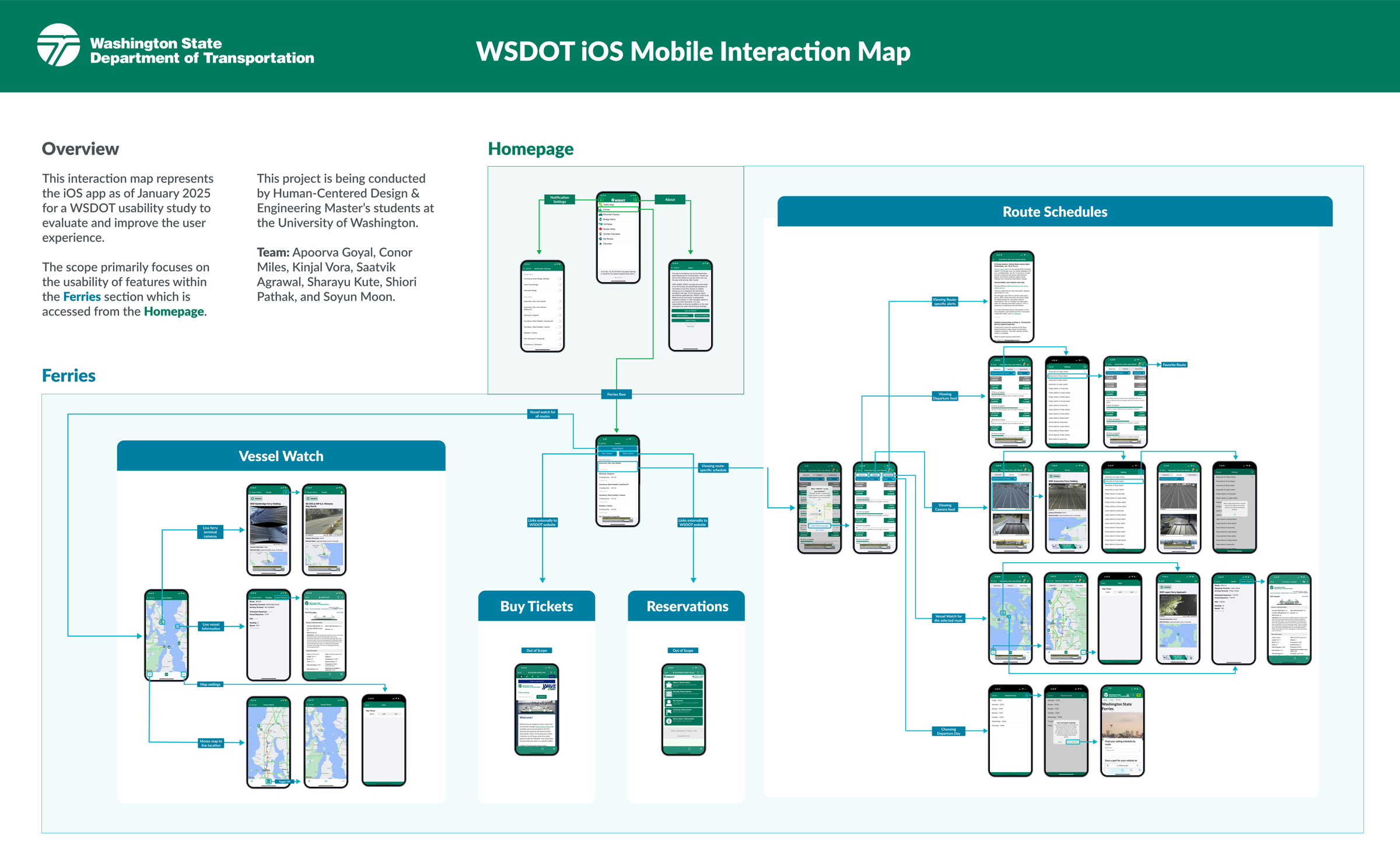
Built a complete interaction map of the Ferries section: Route Schedules, Vessel Watch, Buy Tickets, Reservations.

02

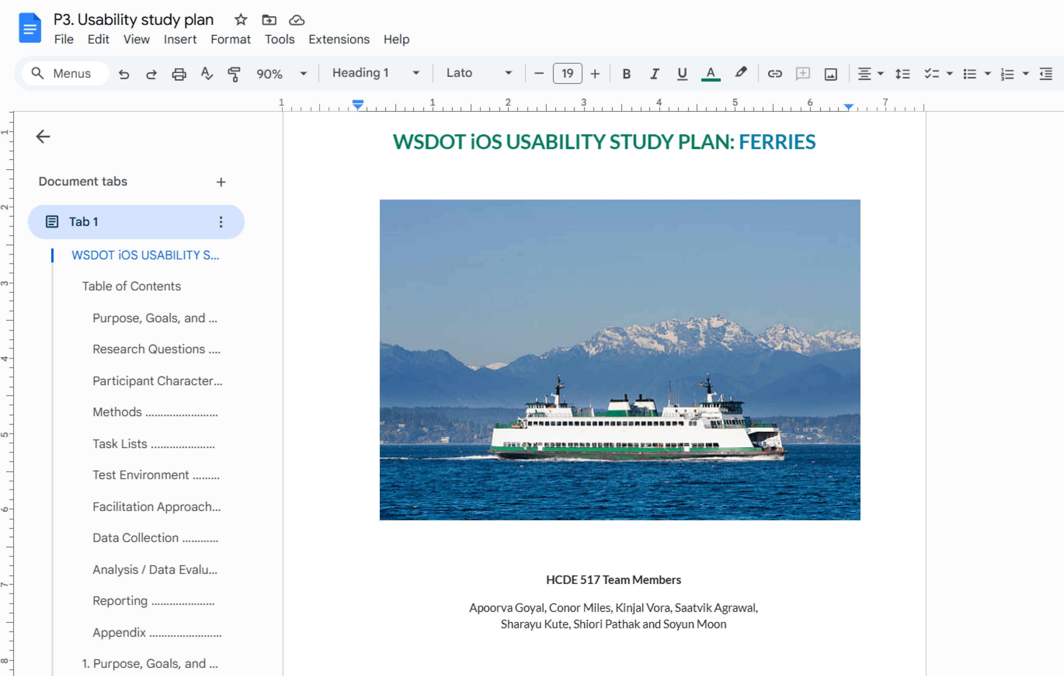
Research plan

9 task scenarios across 4 task groups: capacity, infrequent routes, ETA and alerts, and ticketing.

03

Recruit

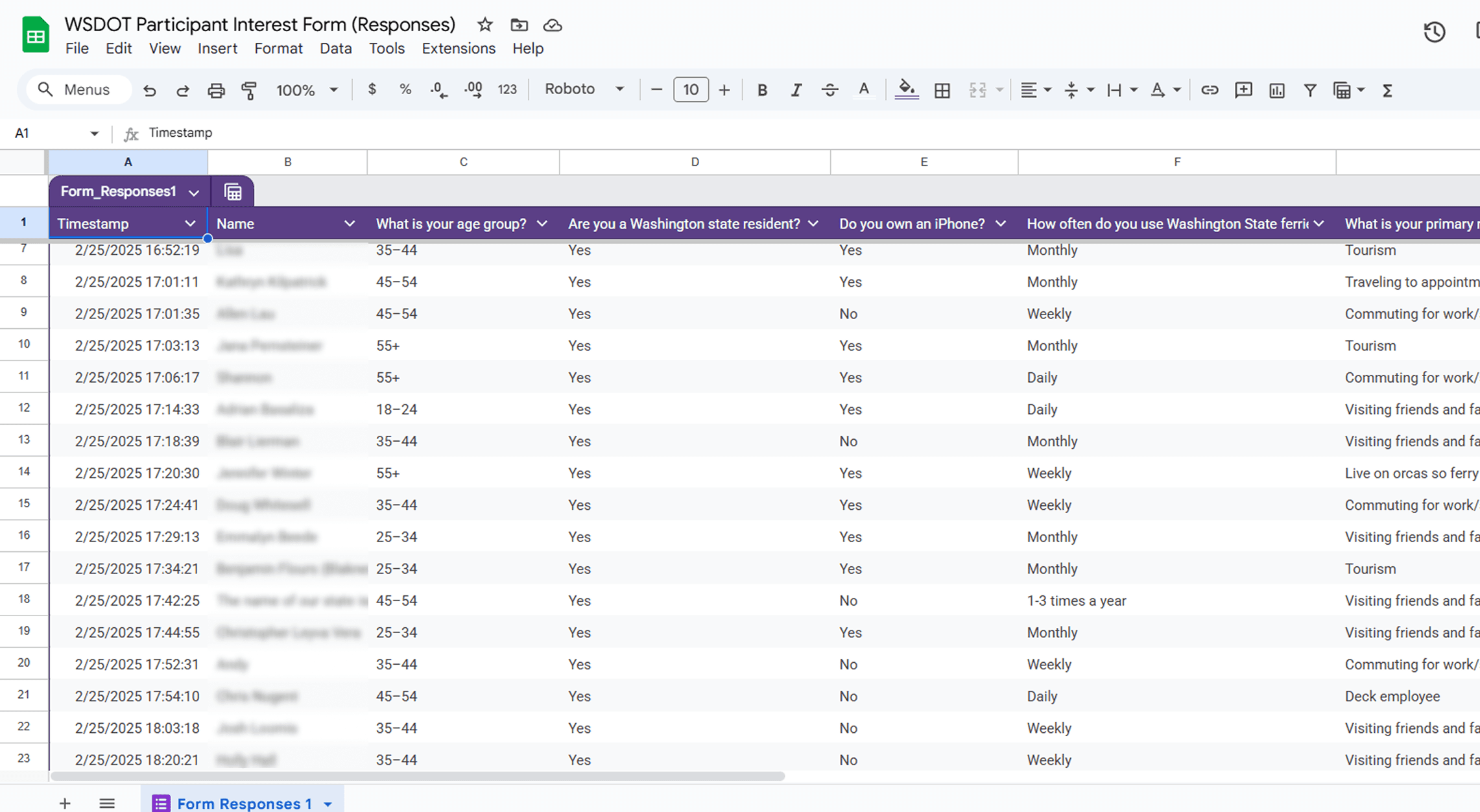
10 Washington residents, iPhone owners, all with prior ferry-app experience. Daily commuters through to annual tourists.

The recruitment screener responses
The recruitment screener responses. Not linked, to protect participant privacy.

04

Moderate

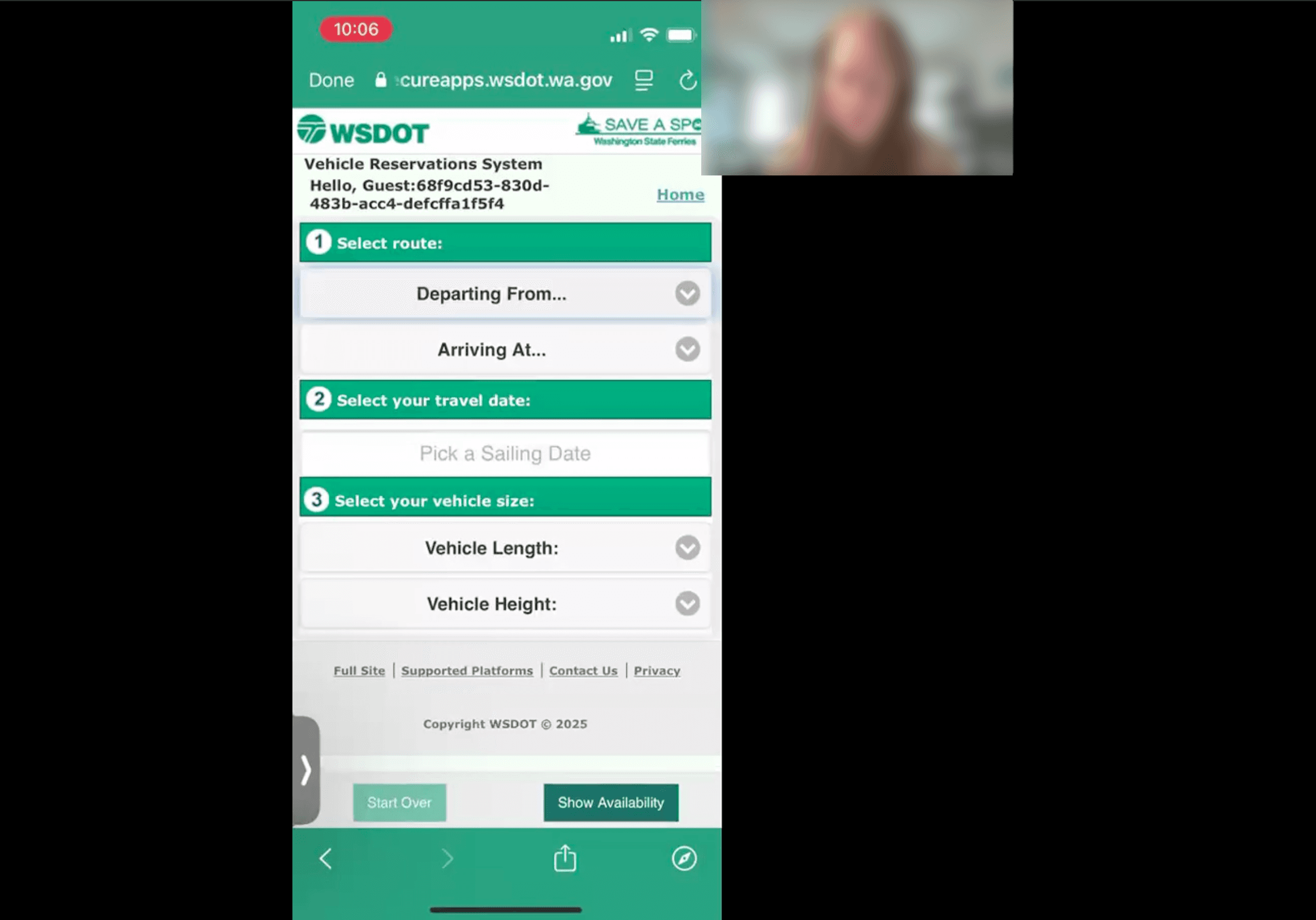
Online sessions with a moderator and a note-taker. Participants on their own iPhones, plus a PC for screen sharing.

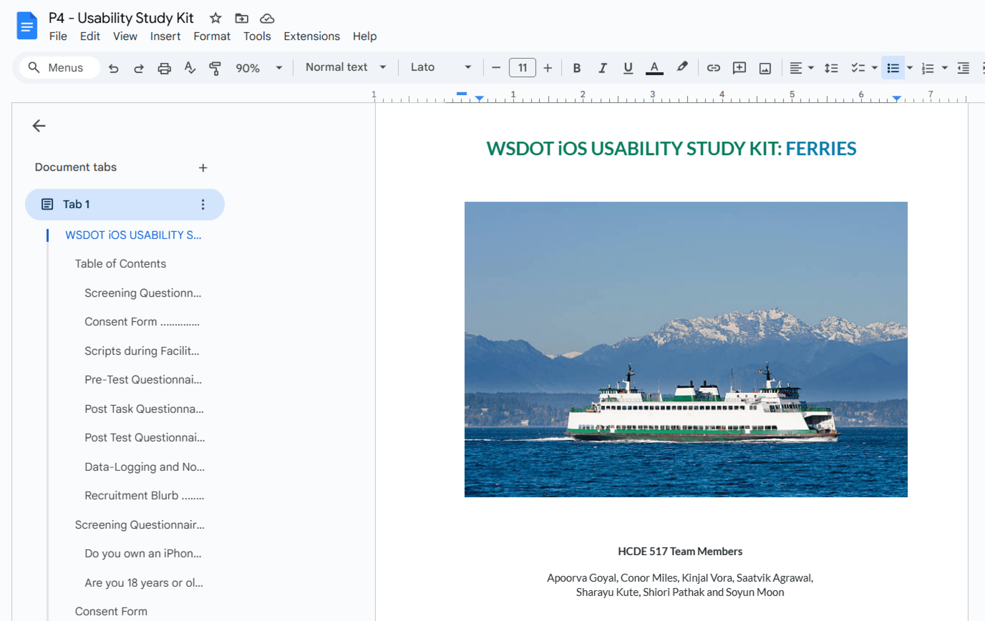
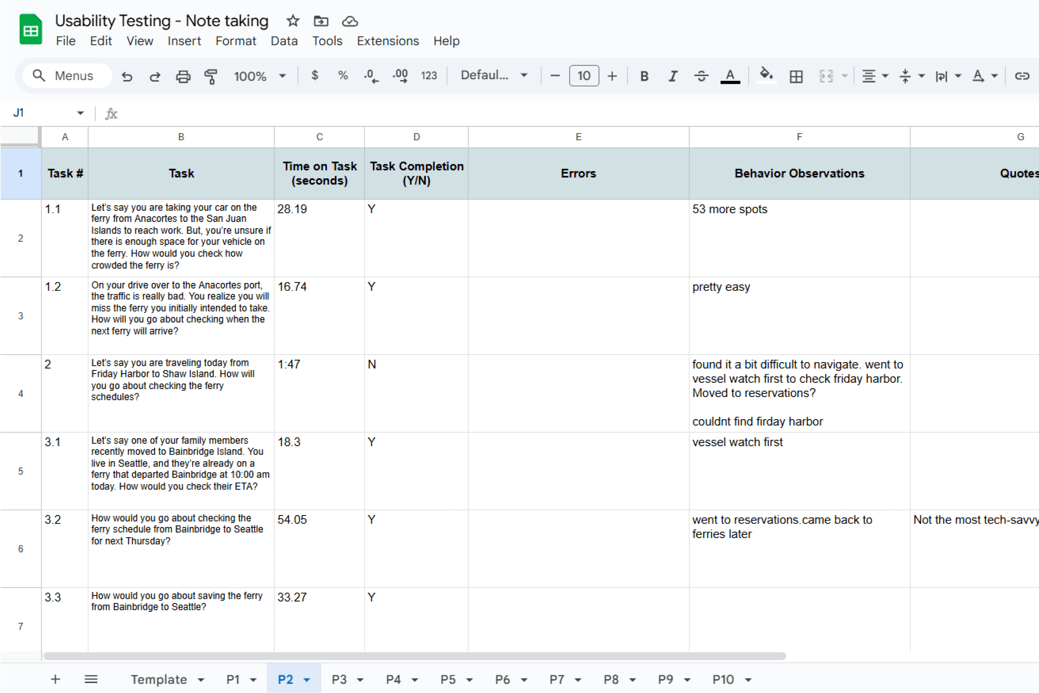
The session sheetOpen
Session notes
Session notes. Not linked, to protect participant privacy.

05

Synthesize

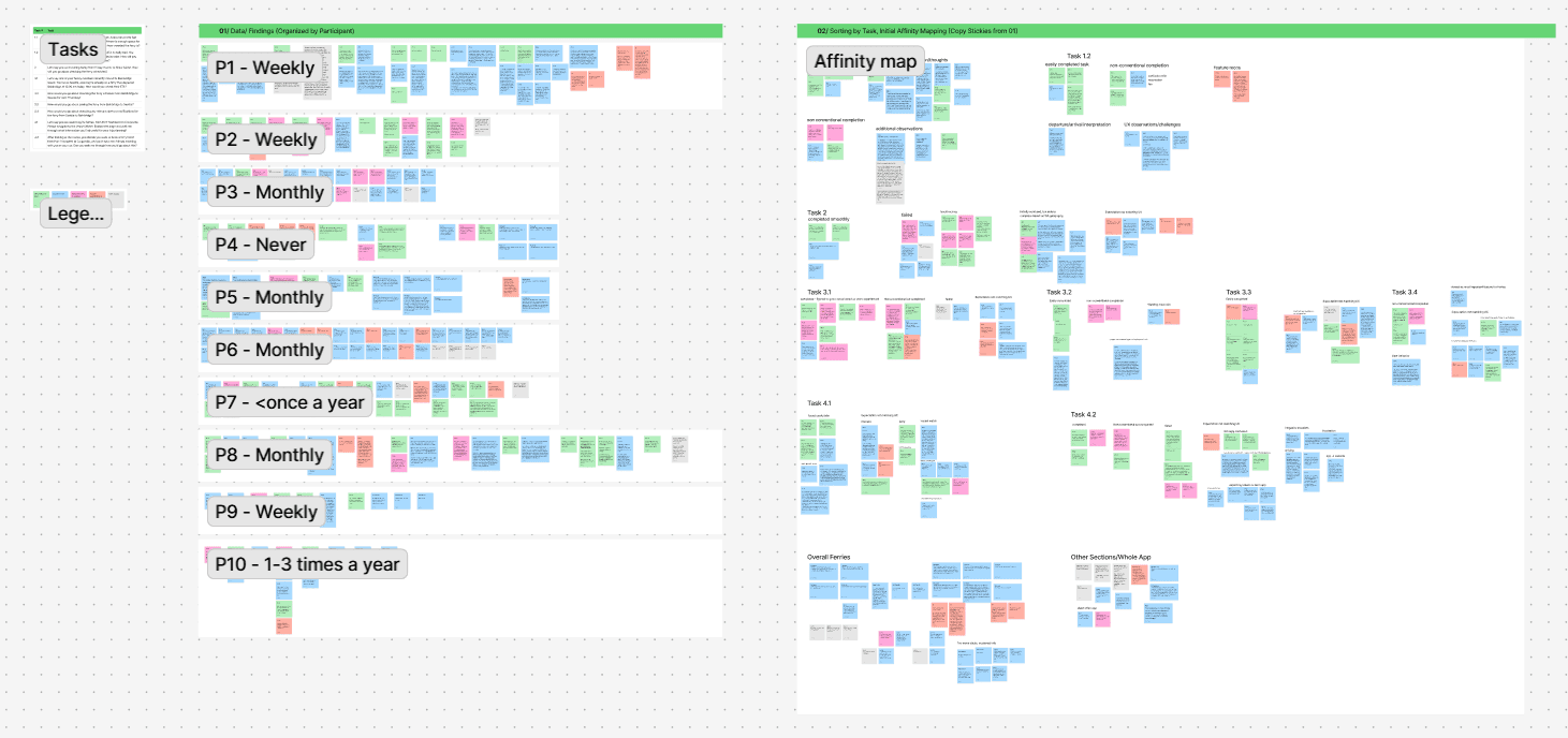
Notes into a spreadsheet: time, completion, errors, quotes and paths. Then an affinity map, built by task.

My contribution

Worked collaboratively through the first three steps, moderated the P9 and P10 sessions and took notes on P4, and worked on the study plan and the affinity-mapping synthesis with the team.

Findings

What happened when people actually used the app.

Task results · 9 scenarios

Times are from P2's full session sheet. The qualitative outcomes draw on affinity-map clusters across all 10 sessions.

  • Completed
  • Mixed
  • Struggled
  • Task 1.1Completed

    Capacity check

    Anacortes → San Juan Islands. Is there space for the car?

    Most completed. Capacity bar interpreted inconsistently.

    28sP2 session sheet

  • Task 1.2Completed

    Next departure

    You're going to miss your ferry. When's the next one?

    Quickly completed. “Pretty easy.”

    17sP2 session sheet

  • Task 2Struggled

    Inter-island route

    Friday Harbor → Shaw Island schedule.

    Failures common. “Couldn't find Friday Harbor.” Backtracking.

    Not timed

  • Task 3.1Mixed

    In-progress ETA

    Family on the Bainbridge ferry. When does it arrive?

    Most went to Vessel Watch first. Some succeeded there; some backtracked.

    18sP2 session sheet

  • Task 3.2Mixed

    Future schedule

    Bainbridge → Seattle, one week from today.

    Longest task. Users went to Reservations first by mistake.

    54sP2 session sheet

  • Task 3.3Completed

    Save route

    Save Bainbridge → Seattle for quick access.

    Largely completed. Save mechanism didn't match expectations.

    33sP2 session sheet

  • Task 3.4Mixed

    Check alerts

    Any alerts for Seattle → Bainbridge?

    Expectation mismatch dominant. Riders wanted alerts tied to saved routes.

    Not timed

  • Task 4.1Mixed

    Explore Vessel Watch

    Port Townsend → Coupeville. What helps trip planning?

    Cameras and live tracking valued, but information felt scattered.

    Not timed

  • Task 4.2Struggled

    Buy a ticket

    Tickets for you, two friends, and a car.

    Most problematic task. External redirect; vehicle-size copy created anxiety.

    Not timed

Five patterns the sessions kept producing.

Twenty-six friction points came out of the study. These are the five that changed how the team talked about the app, each grounded in observed behaviour, navigation paths and quotes from the affinity map.

01

High severity

The ticket-buying flow breaks user expectations entirely.

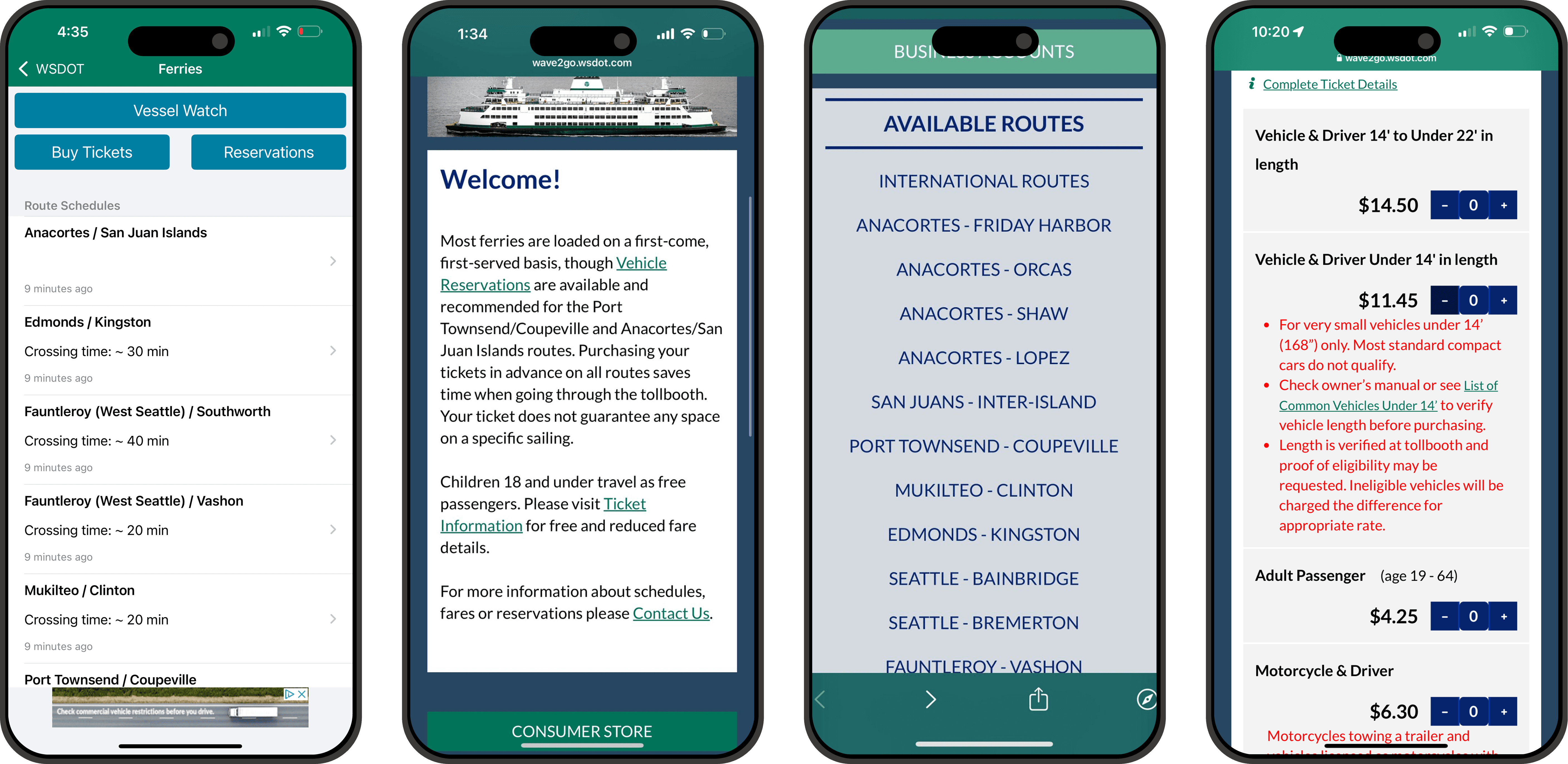
The Buy Tickets redirect to the external wave2go site

When riders tap Buy Tickets, the app redirects them to an external mobile site (wave2go.wsdot.com). The handoff is jarring. The vehicle-size language makes it worse: red warnings that most standard compact cars do not qualify for the smaller bucket, arriving at the exact moment of purchase intent.

Evidence. Task 4.2 was the most consistently problematic across participants. Failure clusters dominated: expecting tickets to be in the app, frustration, non-conventional completions, pricing confusion.

What should changeHigh priority

Bring ticket purchase natively into the iOS app, or at minimum set the expectation before the redirect. Simplify the vehicle-size language: the red “most compact cars don’t qualify” warning creates anxiety exactly when riders are trying to commit.

02

High severity

Vessel Watch became the first instinct, even for tasks it wasn't built for.

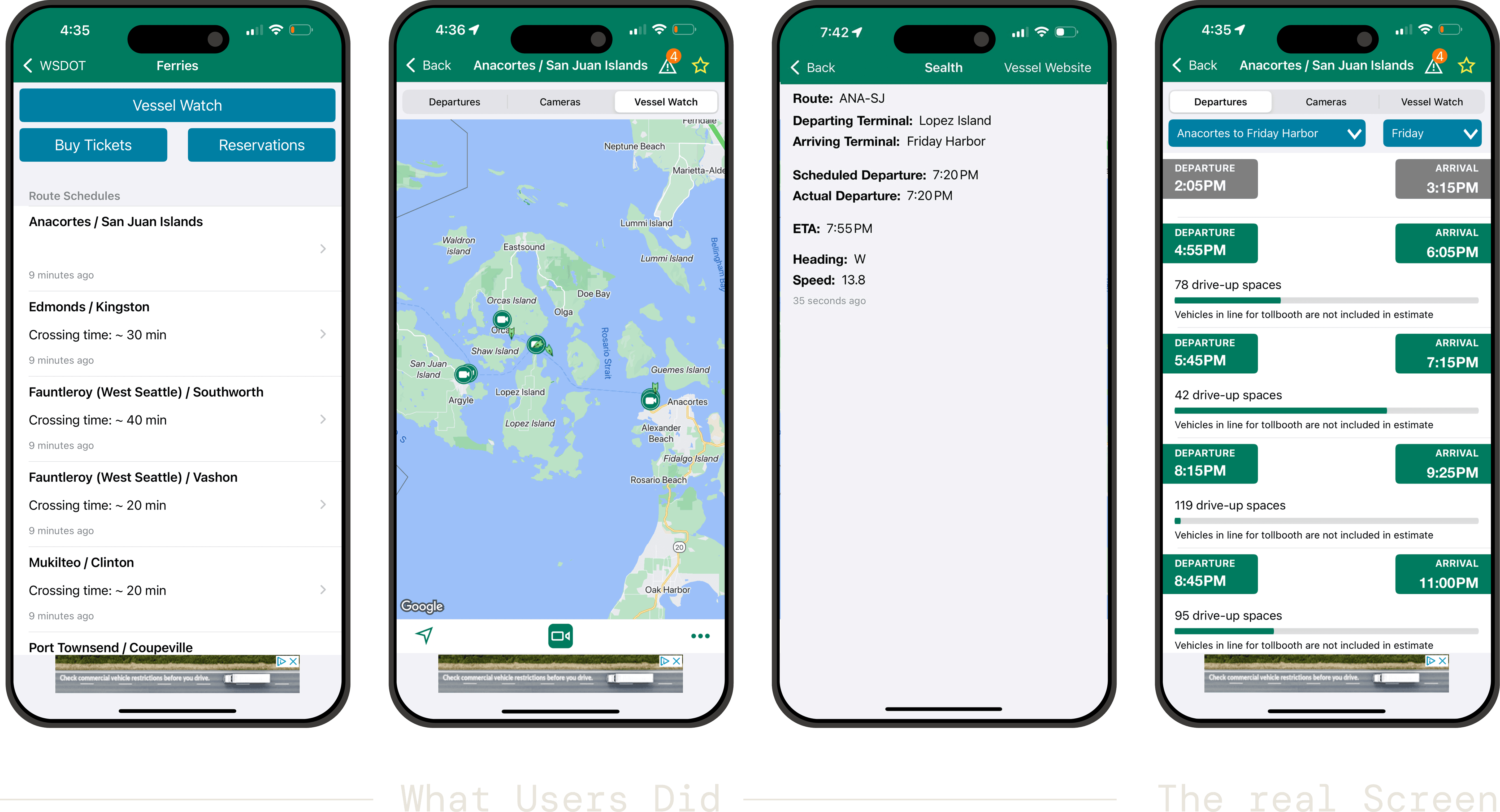
The Vessel Watch live map

Riders went to Vessel Watch first when looking for ETAs, future schedules and trip-planning information. The live map was valued, but the label and the information architecture didn't communicate what each section is for, so riders used the most visual one as a fallback.

Evidence. Tasks 3.1 and 4.1. Multiple participants opened Vessel Watch first and then backtracked; “Vessel Watch first” was the dominant initial-navigation cluster.

What should changeHigh priority

Reconsider “Vessel Watch.” Either rename it for what it is, live vessel locations, or expand it to cover the tracking and schedule jobs riders already bring to it.

03

High severity

Inter-island routes were nearly impossible to find.

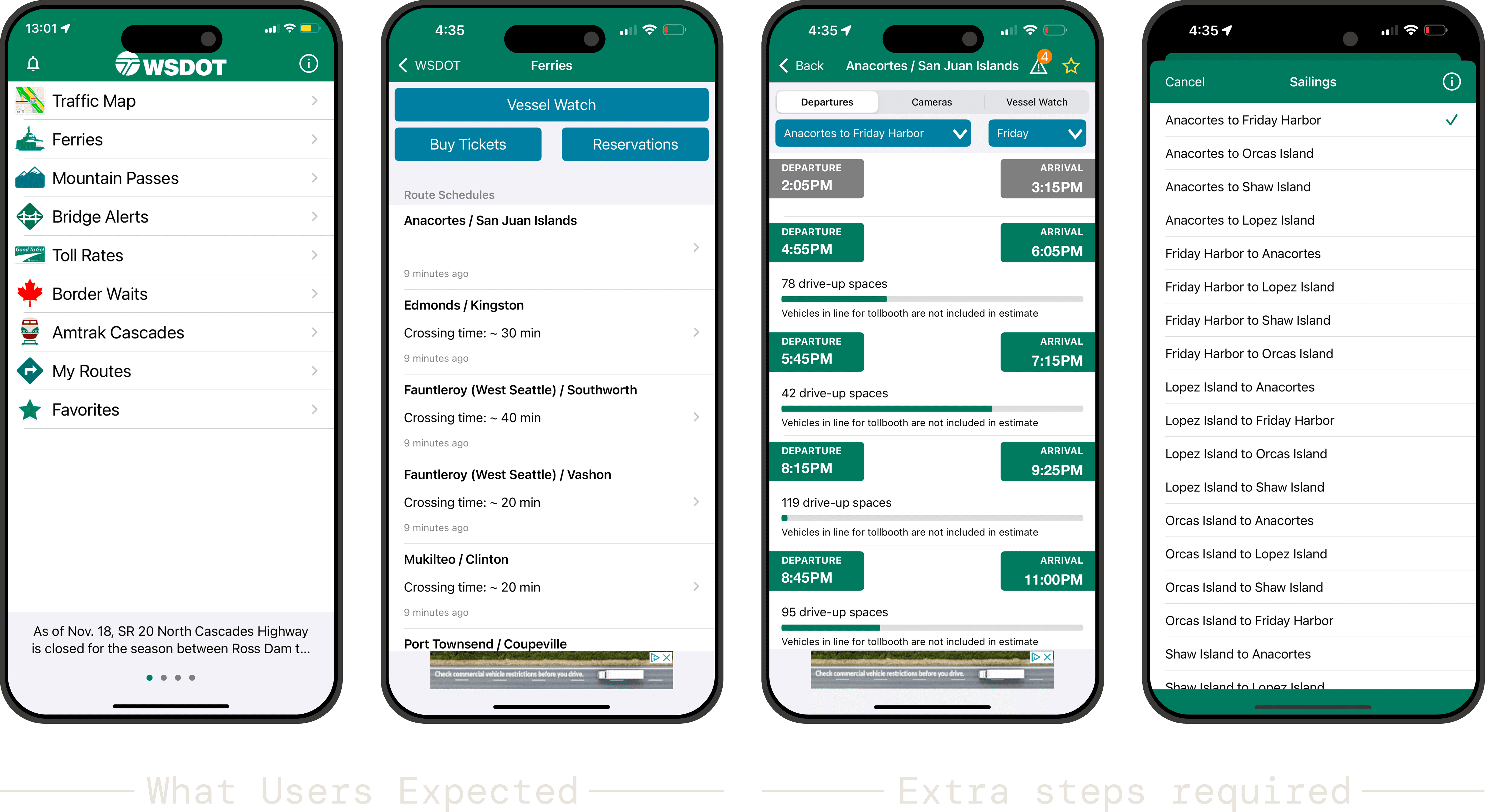
The route schedule list

Friday Harbor → Shaw Island had the highest failure rate. Participants who succeeded leaned on their own knowledge of San Juan Islands geography rather than on the app's structure. The route hierarchy didn't match how riders think about island-to-island travel.

Evidence. Task 2, failure and confusion clusters. P2: “couldn't find Friday Harbor.” The common detour was into Vessel Watch and Reservations before backing out.

What should changeHigh priority

Surface inter-island routes at the top level, or add a route search that doesn’t require riders to already know how the San Juans are organised. As it stands, succeeding at Task 2 is a geography test.

04

Medium severity

Riders expected information to flow across sections; the app keeps it siloed.

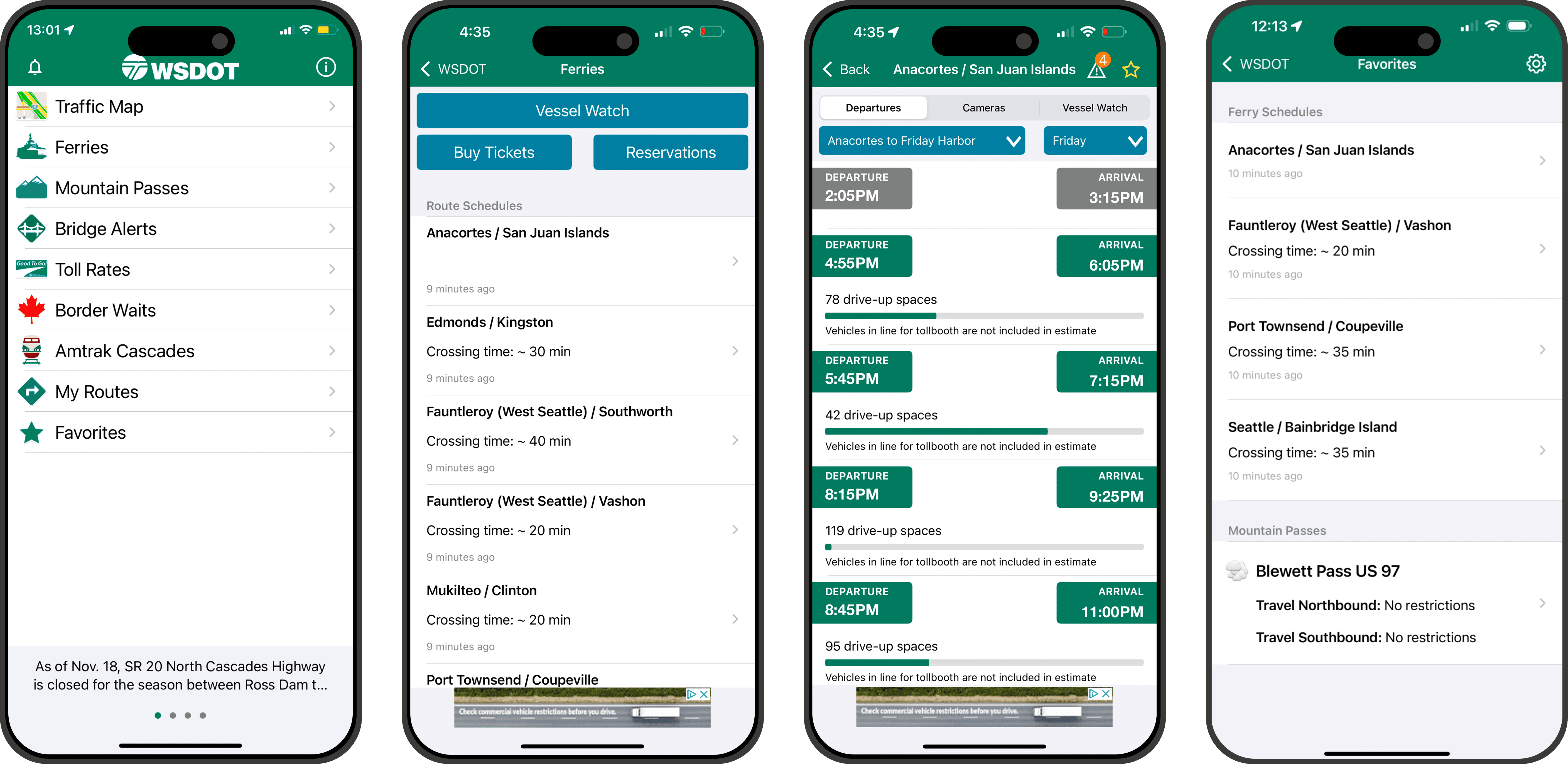
The Departures, Cameras and Vessel Watch tabs

The app splits Departures, Vessel Watch, Buy Tickets, Reservations and Cameras into discrete tabs. Riders expected them to talk to each other. A saved route should carry its alerts, and a future-schedule lookup shouldn't start in Reservations. The separation forced unexpected detours.

Evidence. Tasks 3.2 and 3.4. Riders went to Reservations expecting a schedule, and in the alerts cluster expectation mismatch was the dominant theme, not findability.

What should changeMedium priority

Consolidate around a route-centric trip view that pulls schedule, capacity, reservation status and alerts for one route into one place, instead of asking riders to navigate four sections to assemble a single decision.

05

Medium severity

Drive-up space indicators were visible, but inconsistently understood.

Some participants read “53 more spots” as remaining capacity; others as the total. The green progress bar was noticed, but its meaning wasn't universally clear. The fine-print disclaimer that vehicles in line for the tollbooth aren't included in the estimate was almost never read.

Evidence. Task 1.1 was largely completed, but interpretation observations recurred across participants. Capacity-bar meaning was the dominant secondary cluster.

What should changeMedium priority

Add a short legend on the capacity bar stating what the count means and that vehicles queued for the tollbooth aren’t included. The disclaimer exists today, at a size almost nobody reads.

Reflection

The app is built around what WSDOT publishes: schedules, vessels, reservations, tickets. Riders arrive with one job, which is to get on the right boat. The strongest finding wasn't any single bug. It was the consistent gap between the app's section structure and the route-and-moment mental model riders bring to it.

All friction points, all recommendations, and every session note.

Read the full report

Team · HCDE 517 · Winter/Spring 2025

  • Apoorva Goyal
  • Conor Miles
  • Kinjal Vora
  • Saatvik Agrawal
  • Sharayu Kute
  • Shiori Pathak
  • Soyun Moon

More work